Goal: Help writers choose clear, accessible fonts and sizes to make text comfortable and easy for everyone to read.
The way your text looks is just as important as the words you use. If the font is hard to read, people may stop reading, even if your content is clear.
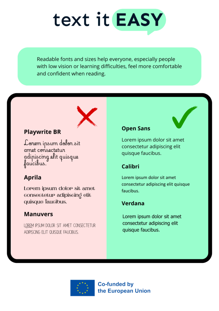
Always choose a simple and clean font. Avoid fancy or curly letters. Good choices include:
- Arial
- Verdana
- Tahoma
- Calibri
These fonts are easier to read, especially for people with reading difficulties.
Another important rule is to make sure your font size is big enough. A good size for printed text is at least 12 points. For online reading, you can use 14 to 16 points or more, depending on the format.
Avoid:
- All CAPITAL letters (they are harder to read)
- Italics for long texts
Readable fonts and sizes help everyone, especially people with low vision or learning difficulties, feel more comfortable and confident when reading.