Goal: Guide writers to use strong contrast, clear layouts, and simple design to make documents visually accessible and easy to read for everyone.
A good layout helps everyone read more easily, especially people with low vision, dyslexia, or other reading difficulties.
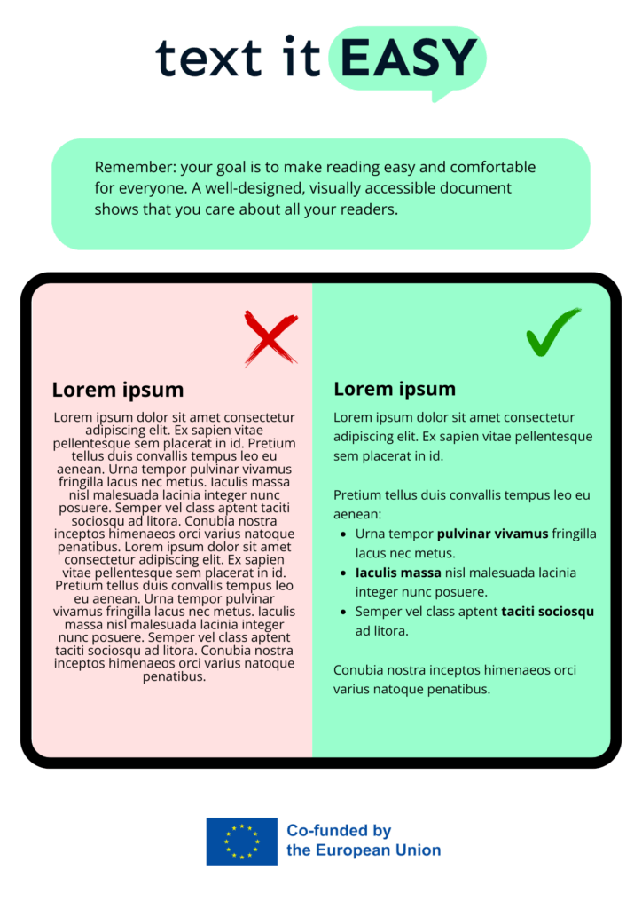
Start with a strong contrast. Use dark text on a light background, like black on white or dark blue on pale yellow. Avoid light grey text or colourful backgrounds that make words hard to see.
Next, think about your layout:
- Use left-aligned text (not centred or justified)
- Keep paragraphs short
- Leave space between lines and sections
- Avoid putting too much text close together
Make sure your design is not too busy. Too many colours, boxes, or decorations can be confusing. Keep it clean and simple.
You can also help readers by:
- Using clear headings
- Highlighting key words in bold (not italics or underline)
- Using icons or images to guide attention
Remember: your goal is to make reading easy and comfortable for everyone. A well-designed, visually accessible document shows that you care about all your readers.